

DYR
Background: DYR is an association of animal shelters. They partner with shelters all over the country to raise awareness and foster the discoverability of pets waiting for a home. They hope that a responsive online website will help them achieve their charitable goals.
Role: UX Designer
Goals: to reach a wider audience, achieve discoverability, and raise awareness
Solution: Create a responsive website and brand identity that reflects DYR's trusting, parental, and approachable brand.
Process: Research --> Define --> Design --> Test
Timeline: 3 weeks
RESEARCH + DISCOVERY
TOOLS USED: MARKET TREND ANALYSIS, COMPETITIVE ANALYSIS, PROVISIONAL PERSONAS, CONTEXTUAL INQUIRY
market & industry research
The first step was to do a quick secondary scan of market trends, which helped me contextualize DYR's situation.
DYR occupies a narrow market for sure. To get a more specific sense of what the market is like, I delved deeper into research and reviewed websites of other pet adoption websites to identify the strengths and weaknesses of competitors.
WHAT I FOUND OUT:
The market for online pet rescues is highly saturated. Standing out from competitors such as Petfinder and Adopt-a-Pet is going to be a challenge. The way to stand out is two-fold: develop a compelling campaign/slogan, and to connect directly with people through social media.
Tapping into the emotions of the adopter is paramount for the success of the website. The key differentiating factor between DYR’s competitions is how well their site taps into the viewer’s emotions. Petfinder, for example, knew my location automatically and showed endless photos of pets in my area needing homes. The website is designed in a cute, positive style. Petango performs the exact same function as Petfinder - however, it’s site is much less saturated with content of animals, and the design feels outdated and stale. The online experience of finding a pet should feel as positive as getting a dog for your 6th birthday.
provisional personas
Guided by my secondary research, I created provision personas to begin thinking about who might make up DYR's user base. These rough personas helped bring focus to my interview questions and allowed me to have a starting point for testing my hypotheses and assumptions regarding the goals, needs and frustrations of users.
User Research
To better understand the behaviors and goals of pet adopters and to test assumptions, I developed an interview script and conducted user interviews with participants who fell within the provisional persona profiles I’d established. On a Thursday afternoon, armed with my clipboard, I walked around town and struck up conversation with people and persuaded them to give me a few minutes of their time to discuss pets. I asked each subject questions about their attitudes, preferences, and experiences. During the interviews, I took notes as I asked questions.
"Don't want to become attached to something and then lose it only a
few years" "education for pet owners is crucial for
the adoption process" "Many people buy dogs impulsively.
They aren't prepared" "We saw her at the store and couldn't leave without her"
"No shelters are open during non-working hours"
Synthesis & Defining
TOOLS USED: EMPATHY MAP, PRIMARY PERSONA, POV + HMW STATEMENTS, BRAINSTORMING
Uncovering Insights + Identifying Needs
Following the interviews, I created an empathy map to synthesize the information gathered during my interviews. I grouped related feedback together, and drew insights from the groupings. Exploring the data in a visual way like this made it easier to spot relationships, which were then used for the foundation of my user persona. I looked for patterns, similarities, and contrasts in order to uncover insights from my observations and move towards identifying implicit user needs.
INSIGHTS:
People have specific preferences when looking to adopt a pet
The cleanliness, staff knowledge, and upkeep of the shelter shape people's opinions of how well the animals are being taken care of
People are largely guided by their emotions when adopting a pet
NEEDS:
People need easy access to information about the pet during the adoption process
People need to trust the shelter to follow through with an adoption
People need to connect emotionally with the adoptable pets
Hannah is the primary persona that emerged as a composite of my research findings. She represents the user we are designing for and helps us to stay focused on designing for the user's needs.

Defining the Design Problem
With my primary persona established, I moved into translating the insights and needs of Hannah into defined Point of View statements, then crafting a set of "How Might We" questions to guide my design.
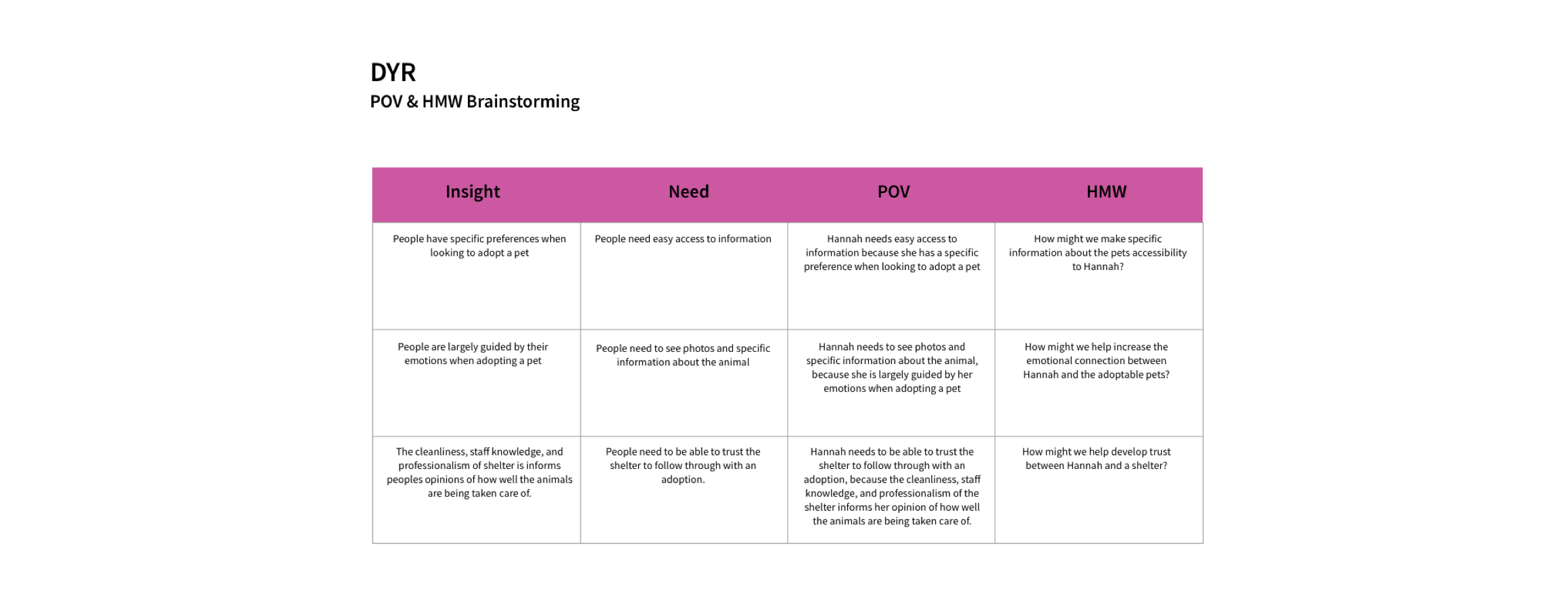
"How might we help increase the emotional connection between Hannah and the adoptable pets?"
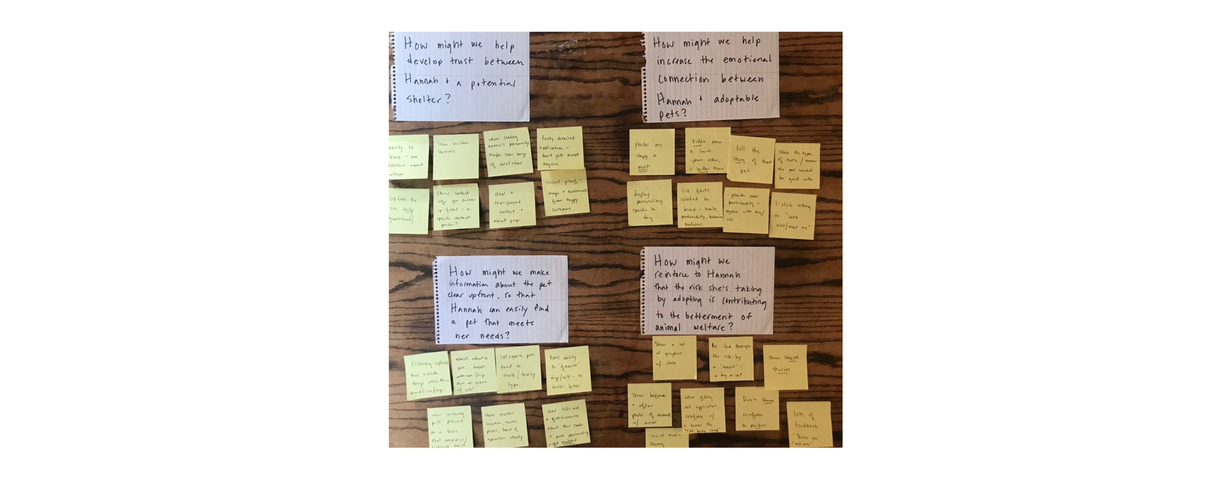
Brainstorming + Ideation
I wrote my "How Might We" questions out, and then generated as many ideas as possible. I spent time rotating through each HMW questions, going through as many rounds as necessary to generate lots of ideas quickly in order to create plenty of options which I could then review, sort out, and refine.
PROJECT STRATEGY
TOOLS USED: PROJECT GOALS MAPPING, PRODUCT ROADMAP, SITE MAPPING
Comparing Business & User Goals
Taking what we learned and using it to start to define the product, I mapped the overlaps of business goals, user goals, and technical considerations. I combined the information gathered during interviews with data from my secondary research to articulate the project goals in the diagram.
With our goals in focus, I created a product roadmap, with features presented in order of priority in terms of development and importance to business and user goals. Hannah's needs and priorities were applied to help keep the focus on the user's needs. The roadmap includes proposed metrics for measurement so that the success of the features can be analyzed.
Mapping It Out
The features and priorities outlined in the product roadmap established what key features must be included in the website. From that, I created a site map demonstrating the content architecture proposed for DYR's site.

INTERACTION DESIGN
TOOLS USED: USER FLOW MAP, TASK FLOW, SKETCHING, WIREFRAMING IN SKETCH, PROTOTYPING IN INVISION
Charting a Path
With the site architecture in place, I moved towards prototyping. I created a user flow based on some simple use cases for Hannah. In this diagram, Hannah moves through two tasks: browsing for pets, and inquiring about a pet saved earlier. I also created a task flow to better understand all of the decision points and actions a user may take while completing the tasks. Mapping out the user's journey from start to completion helped me put myself in the position of the user to make sure the organization of the pages flowed in a logical, smooth way.

Referencing my site map and product roadmap, I then created a detailed list of interface elements for pages within the user flows I'd established. This UI requirements document allows stakeholders to assess and weight in on details of the site before they're implemented, and it served as a checklist for me as I began wireframing. You can view my UI requirements list here.
Wireframing
Before digitally wireframing, I sketched out some low-fidelity wireframe sketches that correspond with the user flows I mapped out. This allowed me to get many different ideas onto paper quickly and be able to easily compare and modify the design. I referenced the UI requirements and site map to make sure I included priority elements for each page, and conducted a brief search for design patterns to reference as well.
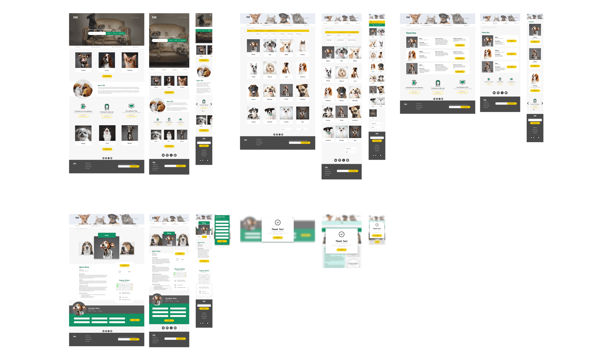
Drawing from my lo-fidelity wireframes, I began working in Sketch to create a set of mid-fidelity responsive screens. This set of wireframes shows the site shows the site pages that a user would encounter as they progress from the home page towards looking for information about pets and reaching out to shelters, focusing solely on function. These frames were developed with the goal of quickly translating them into a prototype, so that I could begin testing my design early in the process. After completing the wireframes, I annotated each wireframes to include details about the intended content and interactivity for the site.

Mid-Fidelity Prototype
With the information architecture and frames established through the mid-fidelity wireframes, I brought my wireframe screens into InVision and created a mid-fidelity prototype to share with users. I was eager to see how the features I included would fare with users.

Usability testing
TOOLS USED: TESTING PLAN AND SCRIPT, INVISION PROTOTYPE, AFFINITY MAP
Before testing the wireframe's functionality, I developed a usability testing plan to outline my test objectives, goals and procedures. You can see the full plan here. Due to time constraints, testing was kept to 3-5 people. I asked participants to click through the prototype with the goal of completing two tasks according to the scenarios I provided, and I observed and took notes as they navigated the site.
Priority Task: Navigate to the pets and inquire about the pet through the shelter
Right away, some issues with the site revealed themselves. Testers all struggled with parts of the site's architecture and navigation. There were also areas of the site that were crowded with information and only distracted the user. While this wasn't what I hoped would happen, it was great to get this feedback early on in the process.
Insights + Recommendations
Drawing from the results of the usability tests, I noted my observations and data, and then organized them according to patterns and trends. I then created an affinity map as a way of interpreting and prioritizing my findings.
Revising the site's architecture and navigation was at the top of the list of recommendations that emerged from my insights. Close behind came the goal of including breadcrumbs and secondary navigational elements to give users a better sense of where they are on the site.

ui design + iteration
TOOLS USED: MOODBOARD, STYL ETILE, HIGH-FIDELITY WIREFRAMES + INVISION PROTOTYPE, UI KIT
Visual Direction & Brainstorming
As DYR didn't have any existing branding, I looked forward to creating brand from scratch. I first created a list of attributes to help me articulate the brand, and I developed a moodboard around them.
I then refined and developed the direction for the visual design, creating a style tile to show how the color palette, typefaces, branding, and icons would be applied across the design of the new site. DYR's brand logo presented a challenge, as the name DYR doesn't give clear insight into the function of the organization. Creating a slogan for DYR helps to communicate their identity and ideals while maintaining the recognition of their organization's name.
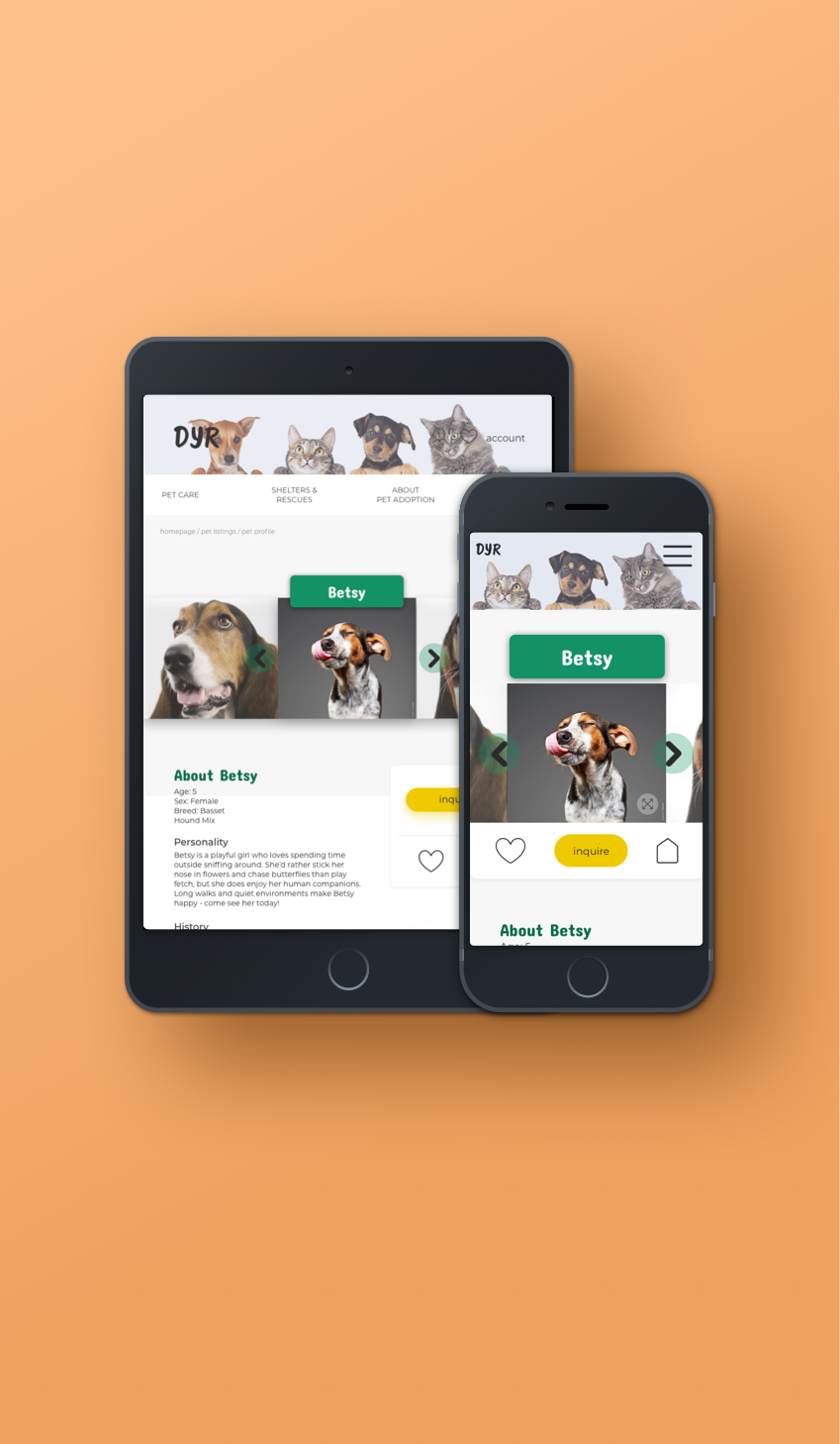
With my recommended revisions established from the affinity map, I moved forward with building a revised set of high-fidelity responsive wireframes. These show how the visual design will be applied to the site and reflect changes made to site architecture and navigation. In this version, the site is simplified, refined, and more streamlined, presenting users with a straightforward experience.
UI Kit
Finally, I created a UI Kit to serve as a reference and resource guide for anyone working on the site. This guide helps to ensure the consistency of styles and elements used across the site.

project takeways
While the needs I extracted were clear, creating a design that served those needs while maintaining simplicity and ease of navigation was a challenge. What surprised me was how narrow the conventions for this type of website are and improving upon those conventions.
In terms of visual design, the biggest challenge was creating a unique brand identity while fitting in to conventions of the current market. There was less freedom with developing the brand identity, as our user tests made it explicit what attracts them emotionally to a certain pet adoption organization. Since photos are such a determining factor for pet adoption sites, conveying DYR's brand identity without a cohesive set of photos made it challenging to convey these wireframes as realistically as possible. Since so much of the site design depended upon conveying the atmosphere and aesthetic specific to this particular bakery, stock photos couldn't easily be found to accurately portray the right look. Higher quality images specific to The Able Baker would certainly strengthen the visual design as represented in the high fidelity wireframes.
Next Steps
With more time, I'd like to replace the images with a more cohesive set of photos and work more on the visual design of the site (I'm not entirely satisfied with the art direction. I'd like to add more depth and details). I'd also love to explore reworking the logo and develop more variations. Most of all, I'd like to follow up with a second round of research and testing, potentially performing A/B testing to determine how design patterns on DYR's site function compare to other sites.