


Spotify
Background: Spotify is the world's leading music streaming app, and it wants to stay that way. For this reason, they want to improve engagement and retention in their app by expanding their social capabilities.
Role: UX Designer
Goals: Design a new feature for Spotify that will help improve user engagement and retention by expanding social capabilities.
Solution: New playlist-sharing and song-sending social features that increasie opportunities for users to engage with friends in a more meaningful and fulfilling way.
Process: RESEARCH I DEFINE | IDEATION | PROTOTYPE | TEST | ITERATE
Timeline: 4 weeks
RESEARCH + DISCOVERY
TOOLS USED: COMPETITIVE ANALYSIS, APP AUDIT, PROVISIONAL PERSONAS, USER INTERVIEWS
market and industry research
To begin, I conducted a rapid research session of secondary sources. I spent a few hours getting a sense of Spotify’s place within the landscape of streaming music providers and gathering enough information to help determine the focus and scope of my research. I identified some key challenges and opportunities and made a list of initial assumptions and questions. From there, I conducted a competitive analysis comparing competitors’ strengths and weaknesses, as well as identifying where opportunities for Spotify to differentiate itself with a social feature might exist.
app audit
In my research, I found that Millenials comprise 72% of Spotify listeners. Millenials are also listed as top smartphone users, with a 98% ownership rate. Based on this information, I made the initial assumption that Spotify’s users might prefer to connect and communicate socially through Spotify via the mobile app. I wanted to become thoroughly familiar with Spotify’s mobile product, so I conducted an app audit. This helped me gain a clear grasp of the app’s architecture, hierarchy and content, which I felt was important to establish before considering how a new feature might integrate within the design.

Provisional Personas
I also created two provisional personas which embody demographic and behavioral traits that match Spotify's core user base and market. These helped me identify people who might be ideal interview subjects and consider how I might want to frame my interview questions and planning.

user interviews
Drawing from the list of questions and assumptions I drafted during my secondary research and research plan, I crafted questions to ask participants about their music listening and sharing habits. The interview guide and script I developed can be found here >. I interviewed 5 people over 2 days. Participants ranged in age from early 20’s to 40 years old, resided in major US cities, and reported listening to music daily.
ASSUMPTIONS I HOPED TO DISPROVE OR VALIDATE:
1)People would like to connect socially over music via Spotify.
2) Spotify users may primarily use the mobile app to access the service.
SYNTHESIS + DEFINING
TOOLS USED: EMPATHY MAP, PRIMARY PERSONA, POV + HMW STATEMENTS, BRAINSTORMING
uncovering insights + identifying needs
Following the interviews, I created an empathy map to synthesize the information gathered during my interviews. I grouped related feedback together, and drew insights from the groupings. Exploring the data in a visual way like this made it easier to spot relationships, which were then used for the foundation of my user persona. I looked for patterns, similarities, and contrasts in order to uncover insights from my observations and move towards identifying implicit user needs.

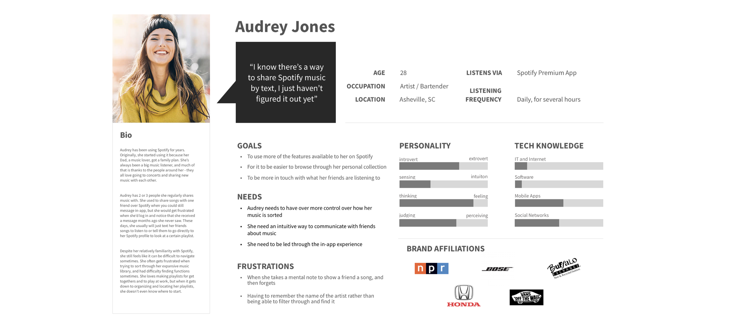
primary user persona
Based on the insights and needs discovered through my primary research synthesis, I established a primary user persona: Audrey Jones. Audrey wants to be more in touch with what her friends are listening to, but she always forgets to send them music when she thinks of it. She also enjoys how Spotify leads her through the app - by great curated playlists, etc. - but wishes there was a good way to see what friend's are listening to, like the Friend Feed on the desktop version.
defining the design problem
With my primary persona established, I began crafting a set of "How Might We" questions to guide my design. Now I felt I was back on track. Reframing the insights and needs identified in my research allowed me to turn them into clearer invitations and challenges for design. At last, I was ready to move into ideation.

brainstorming + ideation
I wrote my "How Might We" questions onto cards, and then spending a few minutes on each card, generated as many ideas as possible. I spent time rotating through each HMW questions, going through as many rounds as necessary to generate lots of ideas quickly in order to create plenty of options which I could then review, sort out, and refine.
PROJECT STRATEGY
TOOLS USED: PROJECT GOALS MAP, PRODUCT ROADMAP, APP MAP
comparing business and user goals
Moving into the next stage of defining the new feature for the Spotify app, I mapped the overlaps of business goals, user goals, and technical considerations. This helped keep the priorities of Spotify in view as I considered how best to design solutions that would satisfy Audrey’s goals as well.
product roadmap
Noting the shared user and business goals, I looked back at ideas generated during brainstorming and determined which ones could be further developed into a social feature that would respons to the needs of both parties. I then outlined specific details for each and prioritized them.

app map
Informed by the features and priorities outlined in my product roadmap, I created a revised app map for Spotify, showing how the new social feature would integrate within the existing architecture of the app.

INTERACTION DESIGN
TOOLS USED: USER FLOW MAP, TASK FLOW, SKETCHING, WIREFRAMING IN SKETCH, PROTOTYPING IN INVISION
charting a path
With the app's architecture understood, I moved towards prototyping. I created a user flow based on some simple use cases for Audrey. In this diagram, Audrey moves through two tasks: sending a song as a gift to a friend, and upvoting a friend's playlist . I also created a task flow to better understand all of the decision points and actions a user may take while completing the tasks. Mapping out the user's journey from start to completion helped me put myself in the position of the user to make sure the organization of the pages flowed in a logical, smooth way.

UI requirements
I then considered what details each screen should include, and outlined them in a UI requirements document. This document served as an outline and checklist for me as I designed the key screens for the user flows, and it conveyed the planned functions and design elements to project stakeholders. You can view the UI requirements list here >.
wireframing
I created low-fidelity wireframe sketches of key frames within the user flows I’d mapped out. These sketches helped me think through the integration of the new feature and layout before moving into digital renderings.

high-fidelity wireframes
I then moved directly into creating high-fidelity wireframes since I was able to work with Spotify’s existing UI and I wanted to develop a prototype that would allow me to test users’ interactions with the new feature in a context as authentic as possible to the real experience of the app.

I included annotations for these wireframes to help create thorough documentation on how the new feature could integrate within the existing interface. Below is one of the screens and the accompanying notes.

I brought my wireframes into InVision and created a high-fidelity prototype to share with users. Click around below to explore the new features!
USABILITY TESTING
TOOLS USED: TESTING PLAN AND SCRIPT, INVISION PROTOTYPE, AFFINITY MAP
I developed a usability testing plan to outline my test objectives, goals and procedures. You can see the full plan here >. I asked participants to navigate through the prototype with the goal of completing three tasks according to the scenarios I provided. I wanted to find out if they could navigate to the feature and create their own posts. I observed and took notes as they moved through the app.
Scenario 1:
You open up your Spotify and notice a new social feature called
“Your Friend’s Top Playlists”. You decide to check it out. Please navigate to
“Michigan Playlist” and upvote it.
Scenario 2:
Say you saved a song earlier and you want to show it to a friend that doesn’t
have Spotify. Navigate to your songs and select the song “Ultimatum - Edit” by
Disclosure. Send it as a gift to your friend.
Scenario 3:
Say that you sent a song as a gift to a friend a while back but you can’t
remember what song it was. Navigate to settings and locate the “Send Gift” history.
Overall, test subjects were able to navigate through the new features and complete the given tasks. All 3 participants hesitated with upvoting shared playlists. Preferences for a “thumbs up” or a heart icon were stated. The existing upward pointing arrow with the led test subjects to think they’d be scrolling through, or that the number below indicated the number of songs in the playlist. Subjects also struggled with locating the gift sending history, located within settings. Once within settings, subjects had no trouble finding the gift sending history, but finding the setting button itself was a challenge. However, without changing Spotify’s existing navigation, there’s little to be done about this. All users felt that the features were easy to navigate through, and other than the upvote, were intuitive. Overall, test subjects seemed to react more positively to the shared playlists feed rather than the gift sending feature.
insights + recommendations
Referring to the notes taken during user testing, I created post-its with observations and notes for each test subject. I looked for patterns and trends and sorted accordingly. I then created an affinity map as a way of translating my observations to insights and recommendations.

Since a large portion of the feedback surrounded the upvote feature, I prioritized reworking the upvote icon and the playlist screen layout. This was a feature included in the product roadmap, and the clear demand/expectation for it was reinforced during user testing. (Note that the prototype above includes the revisions that were made following user testing).
UI design
TOOLS USED: MOODBOARD, STYLE GUIDE,
visual direction
Spotify's visual design is well-established. So in creating a moodboard, I thought specifically about how the new feature would fit within the existing visual design of the Spotify app. This allowed me to focus on specific influences and goals for the feature design.

Pulling from Spotify's branding guidelines, I created a style guide from their existing color palette, type, and styles, adding new elements as needed specific to the Your Friend's Playlist's and Gift Sending features.

iterations
As noted above, based on the recommendations in my affinity map I reworked the playlist page to better guide users towards engaging in the upvote, and implemented a few other small changes.

