


Bhuku
Background: Bhuku is an app for fashion lovers that will help users keep track of what they own, style their pieces, and decide what to purchase next.
Role: UX Designer
Goals: To create a user-centric mobile app and a new brand identity.
Solutions: style personality quiz, in-depth guides, weather syncing, calendar syncing, automatic outfit generator, creating and sharing outfits, “looks of the day”, mood boards
Process: RESEARCH I DEFINE | IDEATION | PROTOTYPE | TEST | ITERATE
Timeline: 4 weeks
RESEARCH + DISCOVERY
TOOLS USED: COMPETITIVE ANALYSIS, PROVISIONAL PERSONAS, USER INTERVIEWS
market and industry research
Before delving deep into research, I needed to create some structure, so I developed a research plan. In it, my research goals, assumptions, methodologies etc., were established. Once my direction was set, I spent some time getting up to speed on closet cataloguing apps and trends within the market. To help identify Bhuku’s positioning within the market, I conducted a competitive analysis. This gave me the opportunity to see how Bhuku might differentiate itself from its competition and provide unique value to users. What I gathered is that fashion cataloguing applications are becoming increasingly mainstream. Competitors such as Cladwell and Stylebook offer undeniable benefits for organizers, planners, and minimalist.
Within the competitive analysis, I also created three provisional personas based on Bhuku’s target market and information I’d gathered during my initial deep dive into secondary sources. This helped me identify people who might be ideal interview subjects and consider how I might want to frame some of my interview questions.
user interviews
After gaining a feel for the market and who my potential users might be, I created an interview script and interviewed 7 people over 2 days. Participants were people ranging in age from early 20’s to 35 years old. All said they experience struggles in knowing how to style pieces and what is appropriate to wear. None had used a closet cataloguing app before.
key findings
Participants had a variety of dressing methodologies and perspectives, but a level of outfit related uncertainty was consistent through all participants. Most commonly cited as a concern was “being comfortable”. I wondered if participants were being 100% truthful with me about their dressing habits, as some subjects seemed self conscious answering certain questions, concerned with exposing details regarding their appearance.
SYNTHESIS + DEFINING
TOOLS USED: EMPATHY MAP, PRIMARY PERSONA, POV + HMW STATEMENTS, BRAINSTORMING
uncovering insights + identifying needs
Following the interviews, I created an empathy map to synthesize the information I gathered. I looked for patterns, themes, similarities, and contrasts. Doing so helped me uncover insights from my observations and move towards identifying implicit user needs.

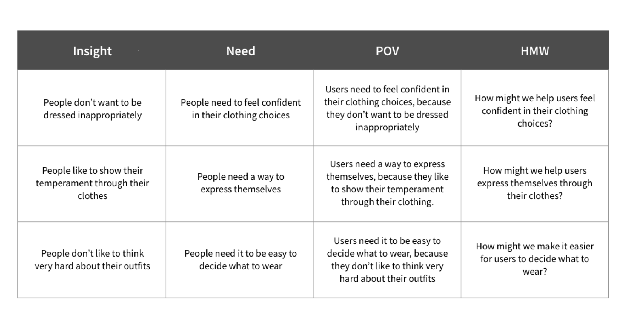
Needs:
Three main needs emerged from my research:
1) People need to feel confident in their clothing choices
2) People need a way to express themselves
3) People need it to be easy to decide what to wear
primary user persona
Drawing from the insights and needs identified via my empathy map, I established a primary user persona: Rose. Rose is a busy person, often going to several events a day, and presenting well is part of her job. Being so busy, she often doesn’t have time to leisurely sort through her closet to get dressed. She finds herself sketching outfit ideas in her notebook on the subway in between meetings - to save time when she needs to get dressed. She needs a simple way to make better use of the clothing she already owns and to have multiple outfit choices for when she is on the go.

defining the design problem
Taking the insights and needs from my empathy map and persona, I translated them into POV ("Point of View") statements and then HMW ("How Might We") questions. Reframing the insights and needs I identified in my research allowed me to turn them into clearer invitations and challenges for design.
brainstorming + ideation
With my POV statements and HMW questions planted in front of me, I led a group brainstorming session with 3 other individuals to generate ideas and consider as many possible solutions I could within the allotted time frame. To do so, I posted each of the three HMW questions on the wall and we spent about 3 minutes brainstorming each question. The next day, after giving myself a mental break, I came back to these HMW questions and performed a rapid brainstorming session on my own. With my brain refreshed, I was able to come up with multiple solutions that weren’t thought of in the first round.

PROJECT STRATEGY
TOOLS USED: PROJECT GOALS MAP, PRODUCT ROADMAP, APP MAP
comparing business and user goals
I had a lot of ideas from my brainstorming and ideation— now, it was time to make some decisions on which ones to pursue. To help focus my project objectives and priorities, I identified where individual business, user, and technical goals overlapped. The resulting shared goals gave me a way of assessing which ideas would be best suited for the needs of both Bhuku and its users.

product roadmap
With my shared goals in mind, I went back to review the ideas I’d generated during brainstorming. I decided to sort through them by marking ideas that felt most promising, and expanding upon ideas that lacked promise. Doing this helped me as I worked towards defining features in my product roadmap.

app map
Informed by the features and priorities outlined in my product roadmap, I created an app map showing the content architecture proposed for Bhuku.

INTERACTION DESIGN
TOOLS USED: USER FLOW, TASK FLOW, SKETCHING, WIREFRAMING IN SKETCH, PROTOTYPING IN INVISION
finding the flow
Referencing the app map, I created a user flow map, working through 2 possible ways a user might interact with Bhuku. I sketched the flows first in pencil and paper, then rendered them in Sketch
While the user flows showed an overview of the complete journey from a user’s entry to their eventual exit, I also wanted to focus on some specific tasks within these flows and carefully consider their details. To do so, I created 2 individual task flows, showing in more detail the user’s process completing tasks within the app. breaking out specific tasks from the first user flow and creating more detailed, individual screens. Doing this helped ensure I was including all necessary screens I’d need as I moved into wireframing.
UI requirements
Referencing the screens I’d mapped out in my user task flows, I considered high level and detailed requirements that the app and each page would need and outlined them in a UI Requirements document. This served as an outline as I designed the key screens for the user flows. You can view the UI requirements list here >
wireframing
Again referencing the task flows, I sketched screen designs for each key frame. I referenced various fashion and closet applications as I considered how to pull from them while also adapting as needed to fit my content. Thinking through the layout, interactions and flows of these screens at this stage helped save time once I moved into creating mid-fidelity wireframes.

prototyping
I then brought my wireframes into InVision and built a mid-fidelity prototype to share with users. Testing the app’s design at this stage, before any visual design had been added, allowed me to get feedback from test subjects that was focused around the concept, organization, flow, and interactions of the app.

USABILITY TESTING
TOOLS USED: TESTING PLAN AND SCRIPT, INVISION PROTOTYPE, AFFINITY MAP
I developed a usability testing plan and defined my test objective and goals. I created a script with 3 scenarios with tasks for test participants to attempt to complete. You can see the full plan here >.
Takeaways
One participant made more errors than the others, skimming and tapping through the pages quickly. This emphasized to me the importance of making sure visual hierarchy and cues are successfully employed to minimize user errors and frustration.
However overall, the general consensus was that Bhuku was simple, straightforward, and easy to understand. Participants enjoyed the very simple and straightforward design and navigation.
insights + recommendations
To synthesize my findings, I created an affinity map. I took the observations and results from my user testing sessions and created sticky notes for each observation and data point, color-coded by user. I then sorted them as pain points or pleasure points. From there, I translated that content into insights and finally made a list of prioritized recommendations for the next iteration, outlining actionable next steps.

A few relatively quick and easy fixes emerged as recommendations for the baseline questions section. Since they involved minimal investment of resources while resolving some points of user frustration, I prioritized them. Beyond those fixes, some broader mandates emerged. It became clear that adding icons and graphics where possible would offer users a way to visually differentiate content and get a quick read not completely dependent upon text. Questions about the large blocks of images that took up the majority of the mid-fidelity screens led me to think they were more of a distraction than anything. I wonder if, in the future, employing low-fi images would allow the participants to feel more focused than using boxes as image stand-ins in content-heavy applications.
UI DESIGN + ITERATION
TOOLS USED: MOODBOARD, STYLE TILE, HIGH-FIDELITY WIREFRAMES + INVISION PROTOTYPE, UI KIT
visual direction
Moving into developing the branding visual design for Bhuku, I began by creating a word map to define some brand attributes. I gathered references for inspiration from various sources and made Pinterest moodboard for the project. After playing around with sketches for Bhuku’s logo, I knew I wanted Bhuku to be a wordmark rather than a logo, so I began researching and playing around with fonts, weights, and spacing that I thought might work.

I then worked on the style tile, trying out colors and approaches in my wireframes to see how they might work in context. I chose simple tones of blacks and whites to convey a sense of strength and luxury, while using softer tints of grey to keep the design feeling dimensional.

Going back to my mid-fidelity wireframes, I applied the colors, styles and icon illustrations outlined in my style tile to create a higher fidelity version while also making recommended changes as outlined in my affinity map. I integrated very basic graphic icons throughout the app to provide visual cues and opportunities to understand content without needing to closely read text. I also revised page layouts and included page names to allow for easier navigation.
high-fidelity prototype
I brought these wireframes into InVision once again, to create a prototype that offers another opportunity for user testing before going further with the site design and implementation.

While working on high fidelity wireframes, I kept versions of the screens within close reach. Being able to see how my design choices alter the visual language of the app was helpful in ensuring I was moving in the right direction visually. Below, you can see the evolution of the home screen from mid fidelity to high fidelity iterations.

ui kit
Finally, I created a UI kit to serve as a reference and resource guide for anyone working on the site. The UI kit provides a place to document styles and elements used across the site, so that they remain consistent.


PROJECT TAKEAWAYS
The market for closet organizing apps is vast, and I certainly feel as though I scratched the surface with this project. While many closet organizing apps offer tons of features, by diving in and testing my concepts at an early stage I was able to get a sense early on of what resonated with users and what might help this product stand out in a crowded marketplace.
next steps
With more time, I’d like to further develop’s social sharing features. While users can currently link their Bhuku to their Pinterest, share their looks with users through iMessage and Instagram, I think there is room to develop this aspect.
Mixed feedback in user interviews revealed that at least a portion of users find social features to be necessary, other users relish being highly integrated within all of their social apps. Further research and testing could prove if further social integration would be successful or unsuccessful for the Bhuku app and help create a more defined point of distinction for the app.