

Zelle
for Hybrid Users
Business Goals:
• Drive the adoption rate up for business accounts
• Increase transaction volume through Zelle
Role: UX Lead
Requirements:
• Create a hybrid experience that is seamless with the current personal experience
• Keep it very lean - minimal changes to personal UX
• Let current users know about the added feature
• Stay within the bounds of EWS guidelines
• Have one entry point
Process: DISCOVERY | DEFINE | IDEATE | ITERATE
Timeline: 12 months
SUMMARY
At Huntington, individuals with personal accounts enjoy the convenience of peer-to-peer transactions through Zelle. Unfortunately, business account holders are stuck with outdated methods for their transactions, impacting about 30% of Huntington's customers who hold both personal and business accounts—dubbed as hybrid users.
To enhance the adoption of business accounts and boost transaction volume through Zelle, Huntington aims to bridge the gap between these two products. The plan involves introducing Zelle to business accounts, enabling all users to make peer-to-peer transactions and business-to-business transactions, and also facilitating the concept of peer-to-business transactions seamlessly.
DISCOVERY
TOOLS USED: COMPETITIVE ANALYSIS, APP AUDIT, STAKEHOLDER INTERVIEWS
market and industry research
At the project's outset, we faced uncertainty about the functionality and user experience of our new hybrid system. The challenge was to seamlessly integrate this hybrid experience with our existing customer journey, adhering to Zelle's comprehensive guidelines covering everything from interaction design to content strategy.
A critical requirement from Zelle was clear yet posed complexities: Hybrid users must have a single entry point into Zelle. This seemingly straightforward mandate became a labyrinth of questions when tackled by architects, UX designers, and business stakeholders.
While awaiting clarity from Zelle, I initiated a rapid research session using secondary sources. In a few hours, I delved into Zelle's position in the money transfer landscape, identifying challenges and opportunities and formulating initial assumptions and questions. A competitive analysis revealed a unique aspect—no competitors treated personal and business transactions as a unified experience, a key requirement for our project. Zelle confirmed our pioneering stance in this approach, marking us as the first of their clients to adopt it.
Designing without established patterns posed challenges, but it also presented an exciting opportunity to pioneer a user experience approach that could set a precedent for others in the future.
app audit
Since Huntington has an established Zelle experience for personal users, the ask was not to create a brand new experience. Instead, it was to build off of the existing experience and bring the business functionality into it seamlessly.
I wanted to become thoroughly familiar with Zelle’s Huntington mobile product, so I conducted an app audit. This helped me gain a clear grasp of the app’s architecture, hierarchy and content, which I felt was important to establish before considering how a new feature might integrate within.
What we identified are 3 main areas to focus our attention:
enrolling in both products for the first time
sending or requesting funds
introducing the added functionality
stakeholder interviews
At this point, the team still had more questions than answers. Ideally we could have conducted some user interviews, but the funding and time was not there for this effort. So drawing from a list of questions and assumptions I drafted during my secondary research and app audit, I crafted questions to ask stakeholders about their money sharing habits. Fortunately, some of our stakeholders are small business owners who hold both personal business accounts with Huntington. Those stakeholders were able to offer us valuable insights into how the ideal experience might function.
ASSUMPTIONS I HOPED TO DISPROVE OR VALIDATE:
1) When making a transaction, the funding source is more important than whether the user is sending or requesting
2) These are two separate products - “business” zelle and “personal” zelle
DEFINING
TOOLS USED: POV + HMW STATEMENTS, BRAINSTORMING
uncovering insights + identifying needs
Following the interviews, there was even more ambiguity around what this product is than before. We felt like we had been thinking about this thing completely the wrong way. Teams from business, architecture and UX could not align on whether this hybrid experience should be presented as two different Zelle experiences vs one Zelle with different avenues the user can take, and our partners at Zelle were not able to provide any further clarity. At this point, teams were starting to talk in circles and it was time to anchor to some visuals, so I took to sketching and put some low fidelity concepts on paper to share with the team. Amping up the visuals during times of confusion can go a long way in building confidence around the subject at hand.
While I was heads down on concepts, I added my notes to the visuals so I could bounce them off the team. Exploring early concepts in a visual way made it easier to spot relationships and pain points, which later on became the foundation of the final solution.
At this point I was looking at functionality and flow to uncover what to avoid and what to dig in to further. Doing this activity and presenting concepts back to the stakeholders allowed us to move closer to identifying an end solution that stays within Zelle’s guidelines and is seamless with the current personal Zelle experience.
Despite these activities moving us forward with confidence, there was still uncertainty around the entry point and what “one entry point” really meant, so we took low fidelity concepts back to our partners at Zelle to get their feedback and insight. What we would learn from that conversation was crucial to narrowing our scope and meeting our timeline:
There is no “Business Zelle” and “Personal Zelle” - to the user, there is one Zelle and they can use both their personal or business accounts to use it.
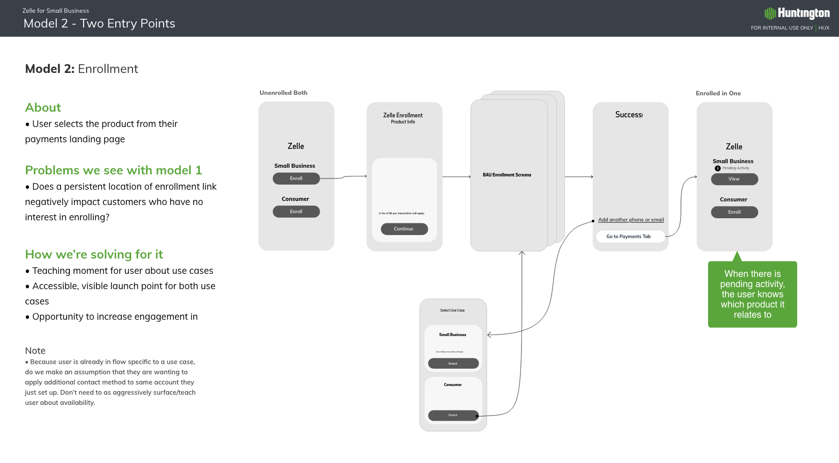
Zelle doesn’t want users to think about Zelle as two separate paths and did not care for model 2. For them, this did not meet the “one entry point” requirement.
Users should have separate enrollment for personal vs. business Zelle
This provided some much needed clarity. Refreshed, we went back to the drawing board, focusing on model 1 but now looking at 2 different iterations. One where the user is selecting the “type” of account they wish to draw from, and one where they’re selecting the specific account to draw from:
INTERACTION DESIGN
TOOLS USED: CONCEPTUAL MODELS, USER FLOWS , TASK FLOWS, WIREFRAMES
charting a path
With the app's high level architecture understood, I moved towards interaction design. Looking at the 2 different models, I created user flows based on some simple use cases for hybrid users: enrolling in a product for the first time, enrolling in the other, and sending money and requesting money. I also created a task flow to better understand all of the decision points and actions a user may take while completing the tasks. Mapping out the user's journey from start to completion helped me put myself in the position of the customer to make sure the organization of the pages flowed in a logical, natural way.
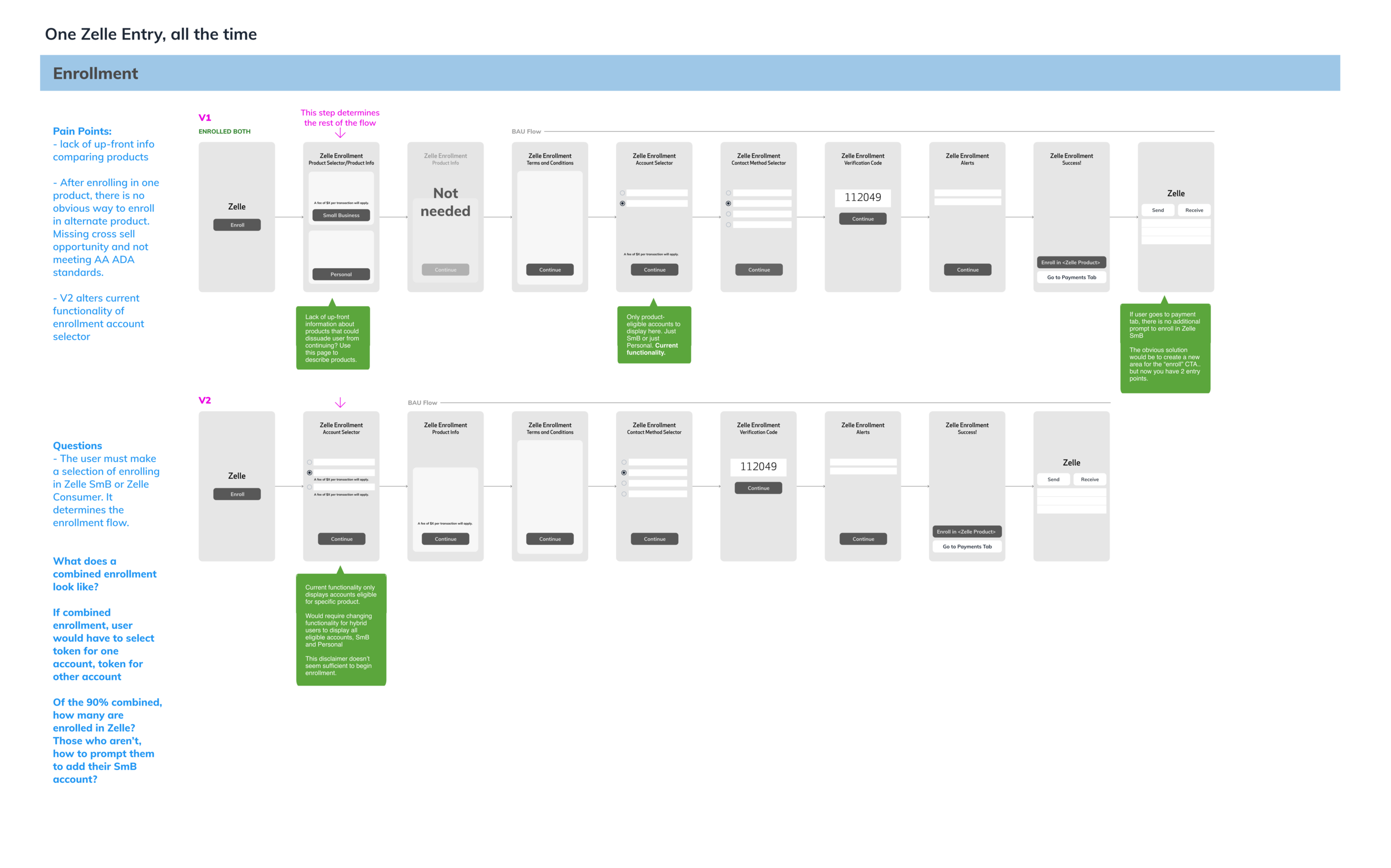
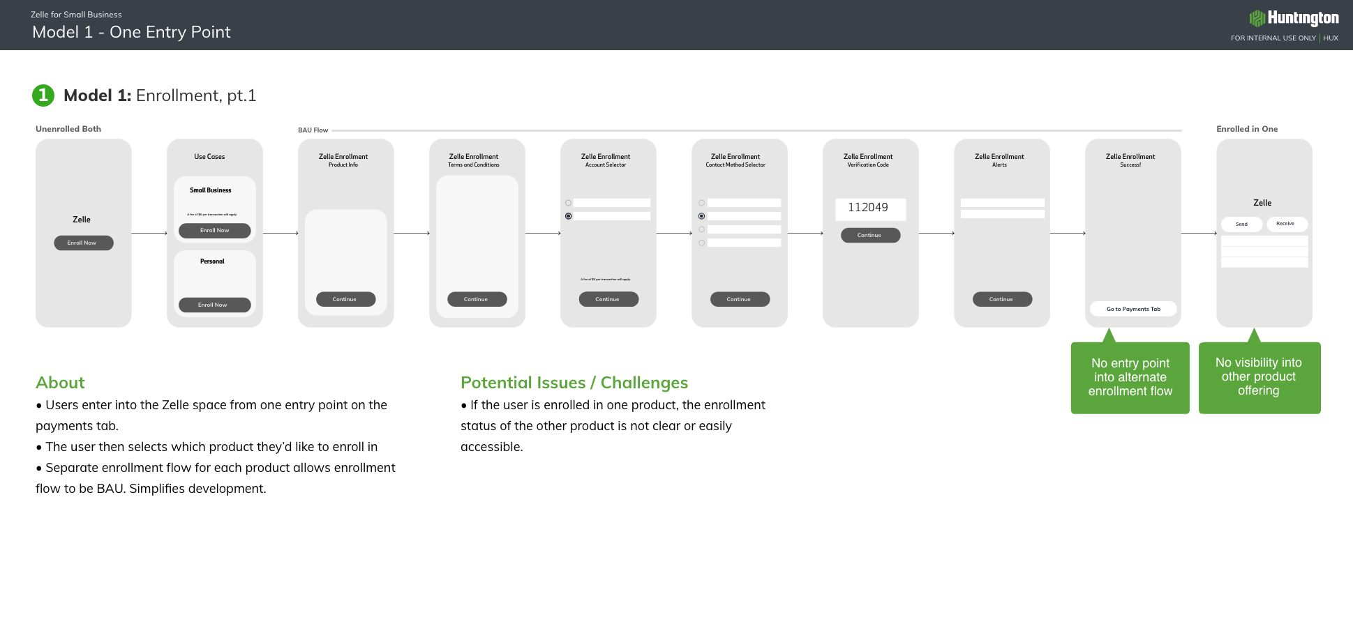
As the style and UI of Zelle was already well established, most of the leg work for this effort was in defining the page flows and architecture. In model 1, above, the hybrid user would click “Enroll” and then have the option to enroll either their business account or personal. This version felt like too much of deviation from the current state, where the user selects the account they wish to pay with, rather than the type of account. That being said, version 2 became the obvious solution. Once the teams all agreed on a path, wireframes came relatively easily.
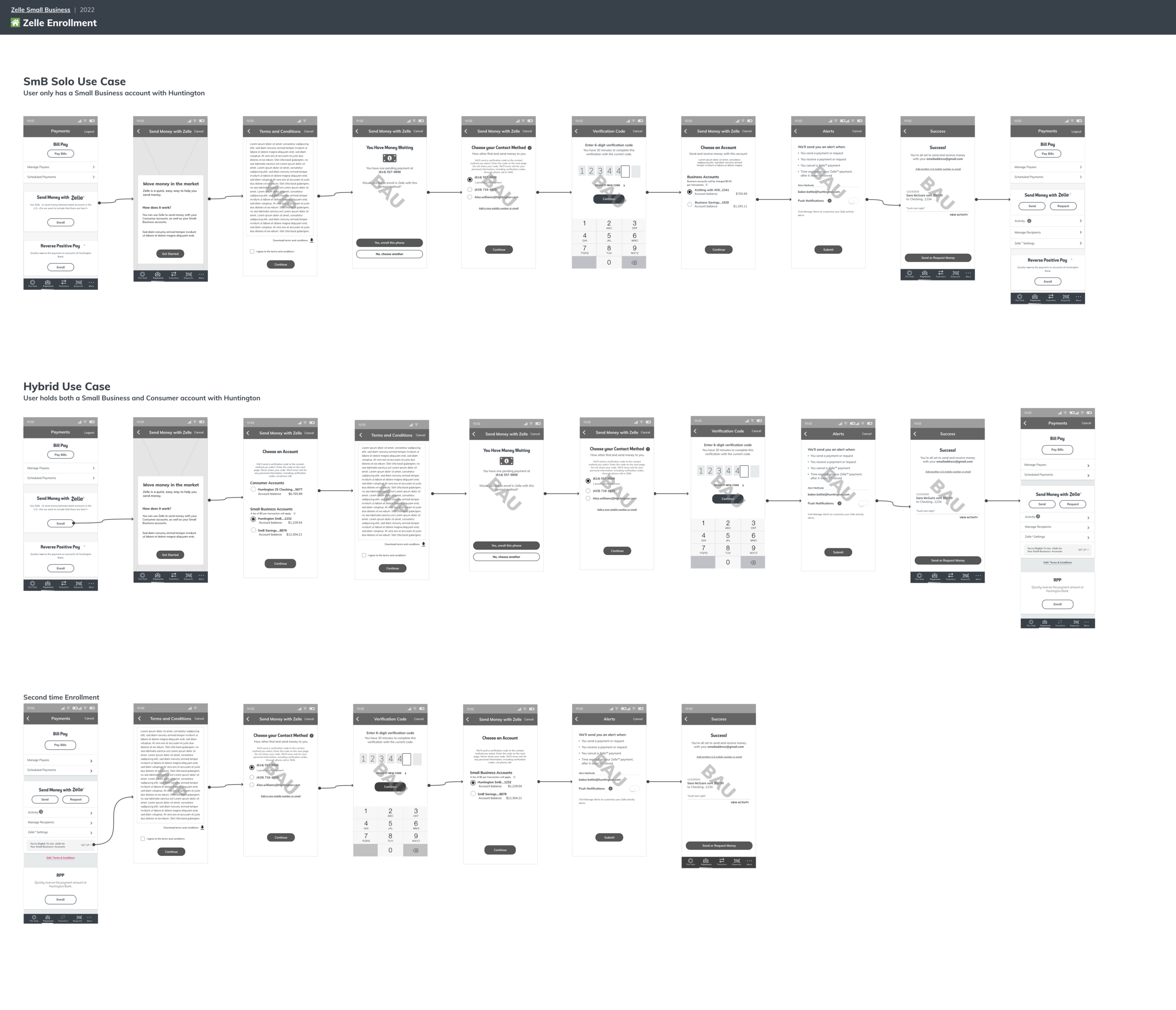
Below - Entry Point: Both hybrid users and non-hybrid users will have the same entry point when unenrolled in Zelle:
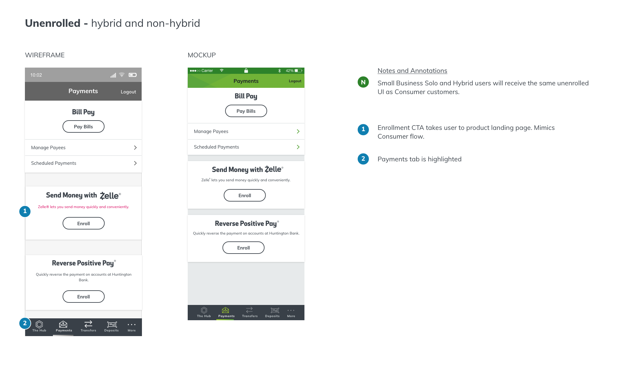
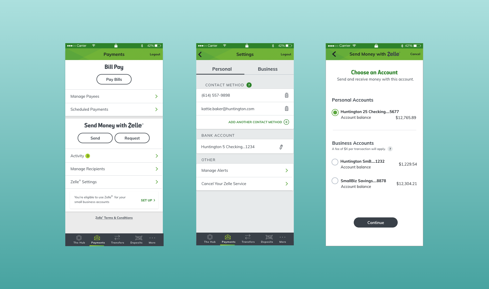
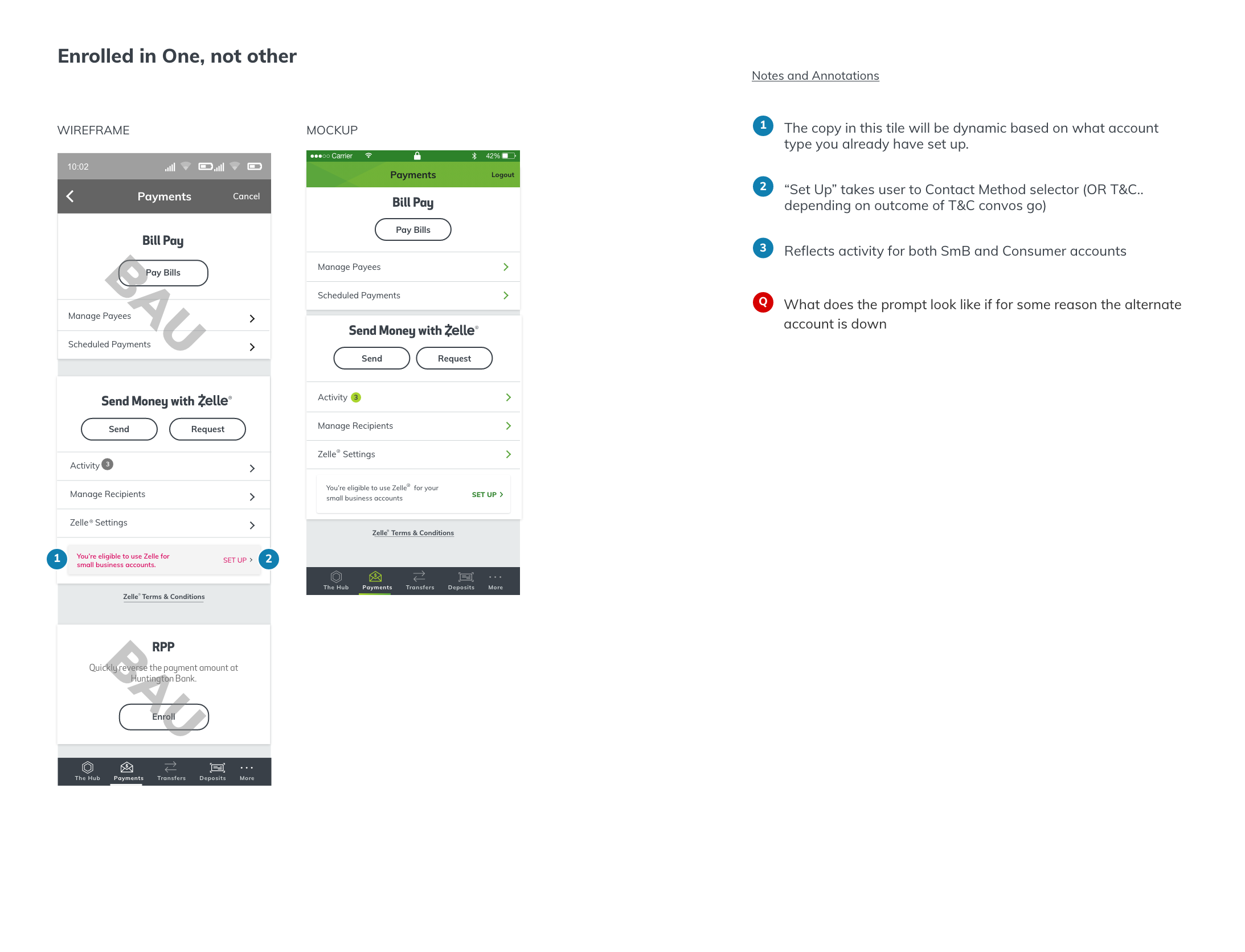
At this point there was one big outstanding UI question, and that was around how we might visually encourage users to set up their alternate account. Existing users who are already enrolled in personal Zelle need a way to know that they can now use their business Zelle, and new users need an access point to setting up their other account after they’ve enrolled in one. The solution we landed on (below) both informs users about the other available Zelle feature, and launches them into enrollment.
DEVELOPMENT
This feature is being developed and has plans to go live in Q3 of 2022. At the time of writing this case study, we’re we’re refining edge cases and error states.
This effort was really a testament to lean UX and maximizing impact with minimal dev effort. I’m happy of the solution we came to because it falls within Zelle’s visual design guidelines, it meet’s the functional requirements, is seamless with the existing consume experience, and it’s so, so simple.
It will be interesting to see how success is measured for this product once it launches. I’m sure there are pain points in the experience that we will uncover once the product roles out. I look forward to the user feedback about this feature.